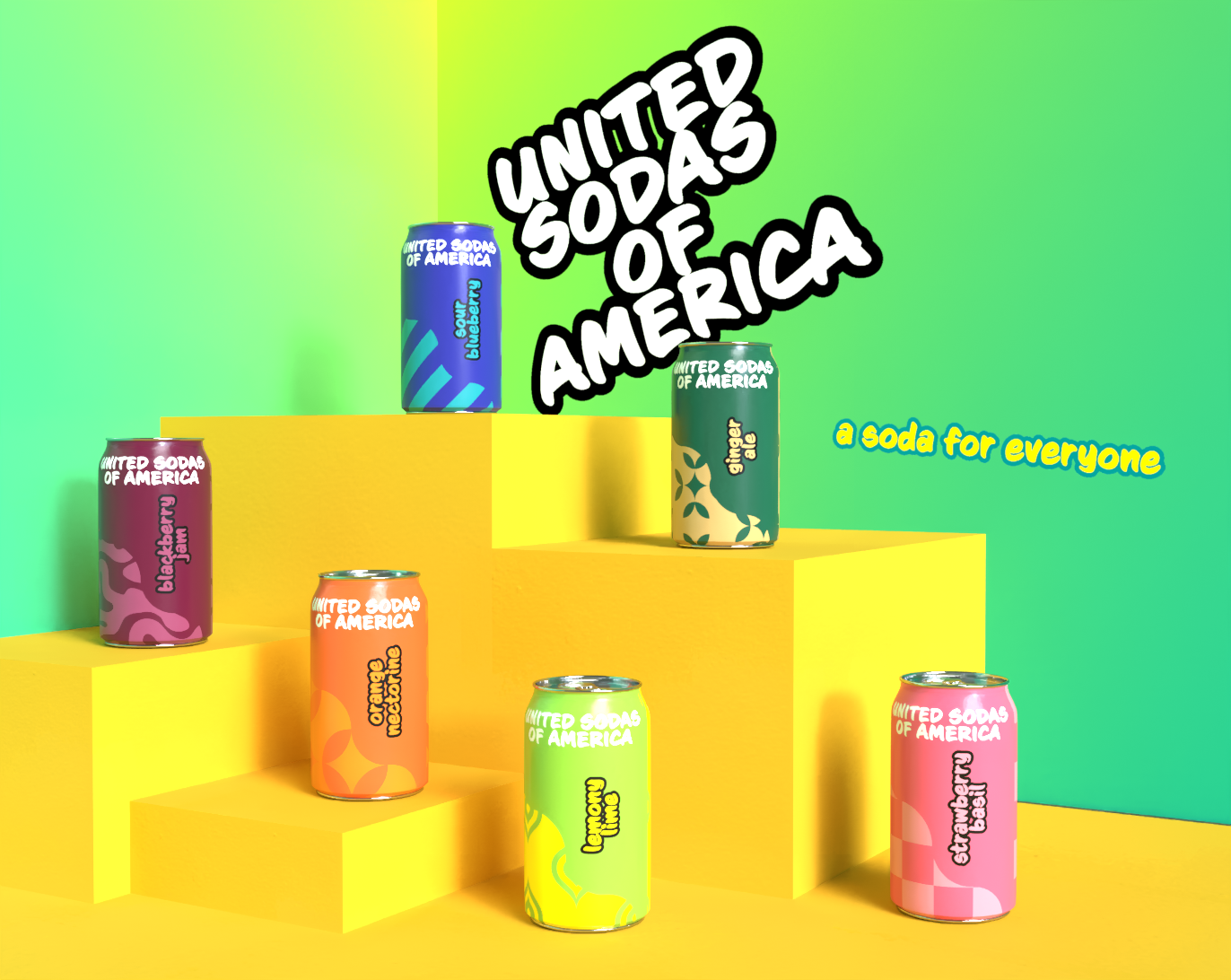
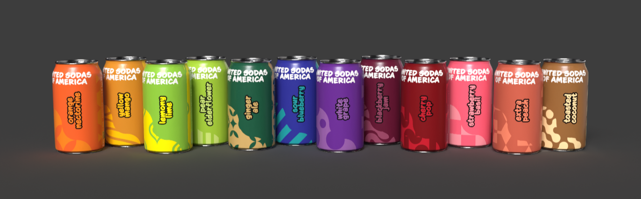
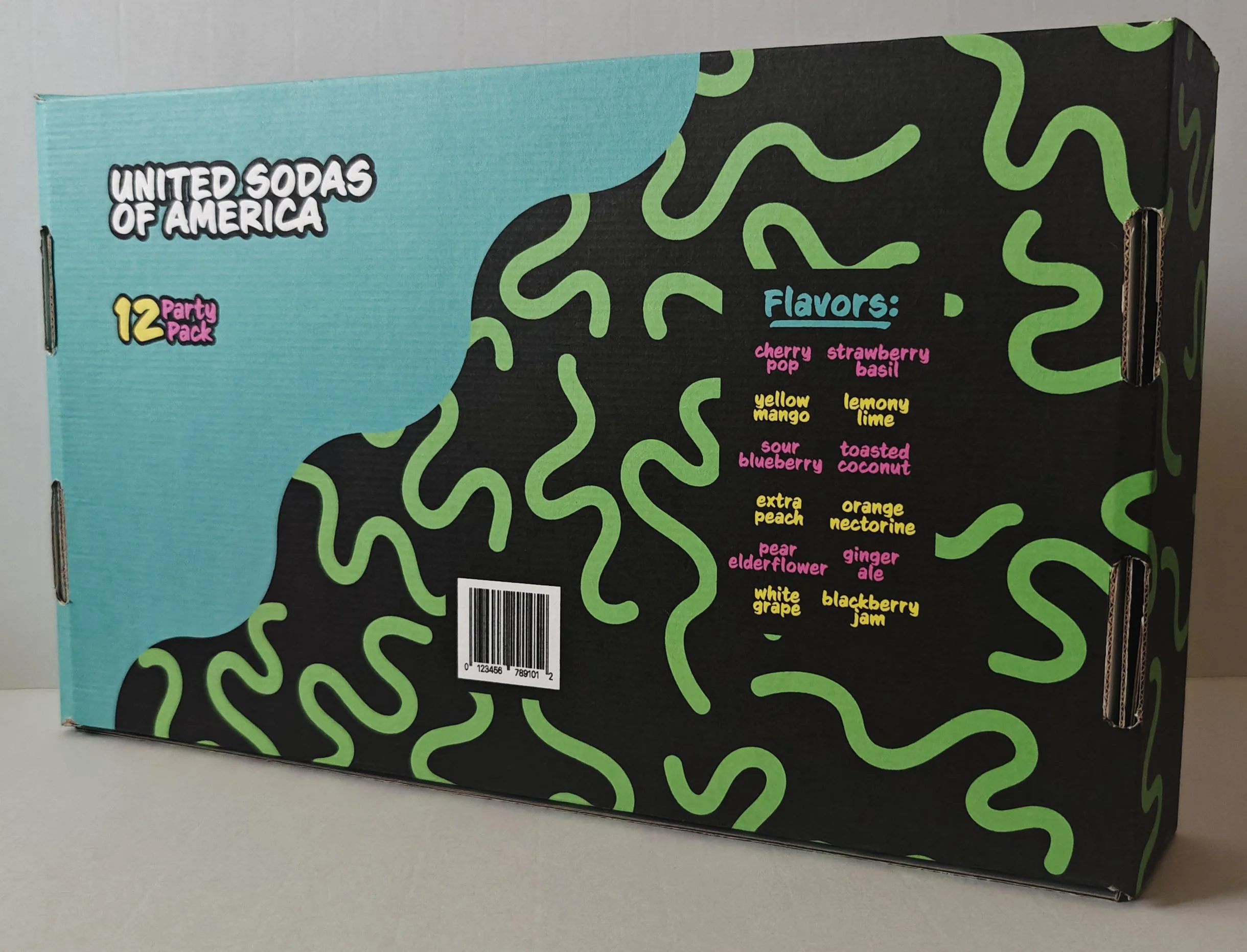
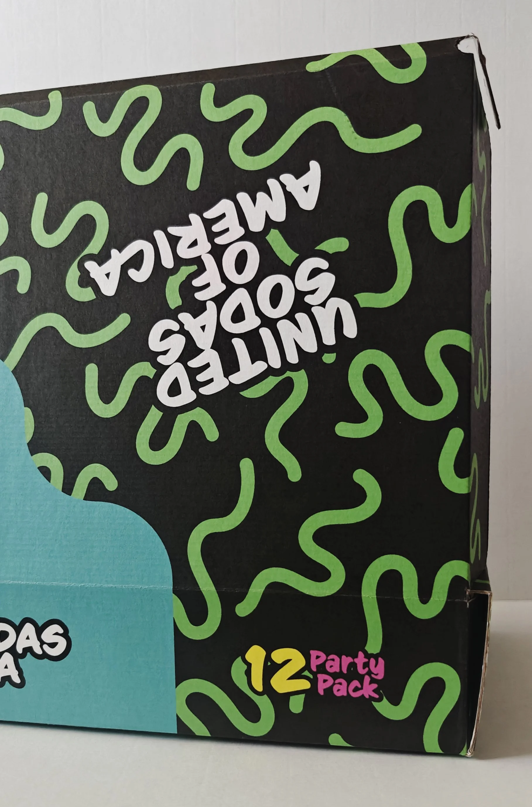
United Sodas of America Redesign
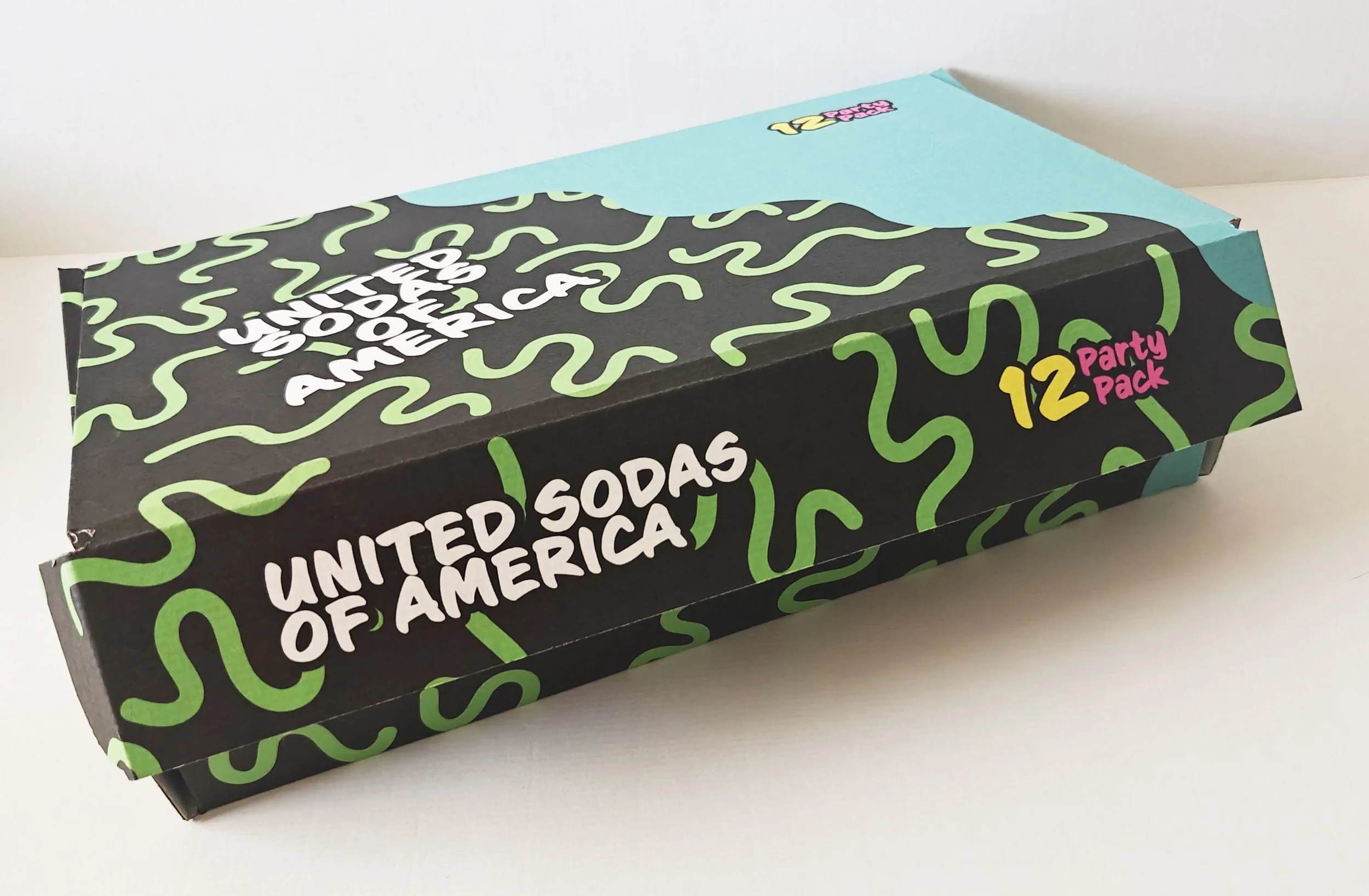
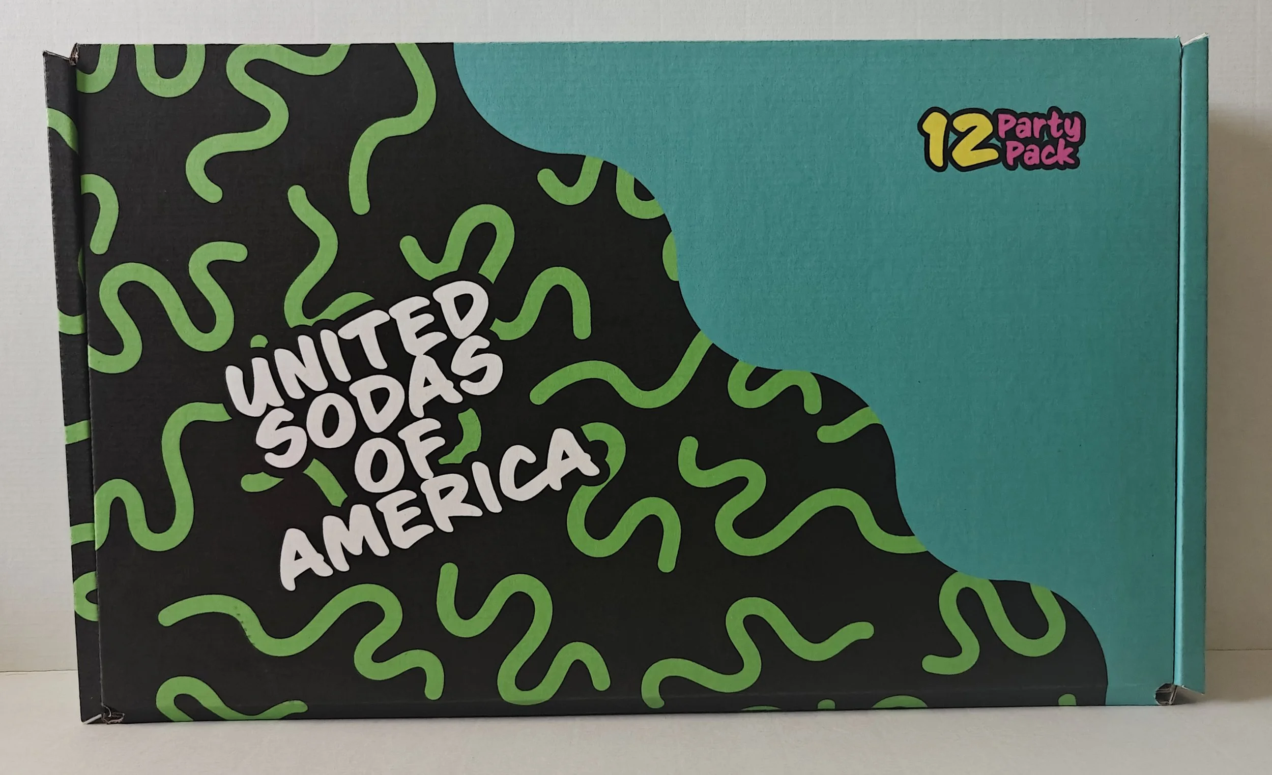
The redesign of United Sodas of America creates a bright, expressive system where each can is as unique as the consumer. Every flavor features its own bold colors and distinct pattern on each can. The typography was used to feel hand-drawn, adding a personal, human touch. This approach carries through the logo and shipping box, resulting in a playful packaging system that celebrates self-expression and variety.